In [1]:
%matplotlib inline
import matplotlib.pyplot as plt
import numpy as np
import sympy as sy
from scipy import interpolate, stats
Regression and Least Squares
Earlier, we encountered interpolation as a means to determine a line given only a few points. Interpolation determined a polynomial that would go through each point. This is not always sensible however.
Let’s consider the following example where the data represents cigarette consumption and death rates for countries given.
| Country | Cigarette Consumption | Deaths per Million |
|---|---|---|
| Norway | 250 | 95 |
| Sweden | 300 | 120 |
| Denmark | 350 | 165 |
| Australia | 470 | 170 |
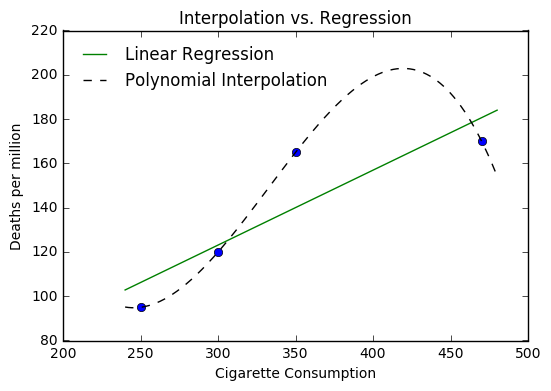
If we use interpolation as we had earlier, we get the following picture.
In [2]:
cigs = [250, 300, 350, 470]
death = [95, 120, 165, 170]

xs = np.linspace(240, 480, 1000)
i1 = interpolate.splrep(cigs, death, s=0)
ynews = interpolate.splev(xs, i1, der = 0)


plt.plot(cigs, death, 'o')
plt.plot(xs, ynews, '--k')
plt.title("Interpolation Polynomial of Cigarette Data")
plt.xlabel("Cigarette Consumption")
plt.ylabel("Deaths per million")
Out[2]:
<matplotlib.text.Text at 0x10fdfd400>
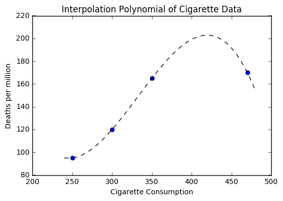
Now suppose that we wanted to use our polynomial to make a prediction about a country with higher cigarette consumption than that of Australia. You should notice that our polynomial would provide an estimate that is lower.
Alternatively, we can fit a straight line to the data with a simple
numpy function polyfit where we describe the data we are fitting and
the degree polynomial we are fitting. Here we want a straight line so we
choose degree 1.
In [3]:
a, b = np.polyfit(cigs, death, 1)
In [4]:
def l(x):
    return a*x + b
In [5]:
xs = np.linspace(240, 480, 1000)
i1 = interpolate.splrep(cigs, death, s=0)
ynews = interpolate.splev(xs, i1, der = 0)
plt.plot(cigs, death, 'o')
plt.plot(xs, l(xs), label = 'Linear Regression')
plt.plot(xs, ynews, '--k', label = 'Polynomial Interpolation')
plt.title("Interpolation vs. Regression")
plt.xlabel("Cigarette Consumption")
plt.ylabel("Deaths per million")
plt.legend(loc = 'best', frameon = False)
Out[5]:
<matplotlib.legend.Legend at 0x110456d30>
Determining the Line of Best Fit
The idea behind our line of best fit, is that it minimizes the distance between itself and all the data points. These distances are called residuals and are shown in the plot below.
In [6]:
plt.plot(cigs, death, 'o')
plt.plot(xs, l(xs), label = 'Linear Regression')
plt.plot((cigs[0], cigs[0]), (death[0], l(cigs[0])), c = 'red')
plt.plot((cigs[1], cigs[1]), (death[1], l(cigs[1])), c = 'red')
plt.plot((cigs[2], cigs[2]), (death[2], l(cigs[2])), c = 'red')
plt.plot((cigs[3], cigs[3]), (death[3], l(cigs[3])), c = 'red')
plt.title("Residuals")
Out[6]:
<matplotlib.text.Text at 0x1104bc710>
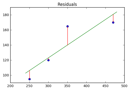
The line of best fit minimizes these distances using familiar techniques of differentiation that we have studied. First, we investigate the criteria of least squares, that says the residuals are minimized by finding the smallest ROOT MEAN SQUARE ERROR or RMSE.
In general, we see that a residual is the distance between some actual data point \((x_i, y_i)\) and the resulting point on the line of best fit \(l(x)\) at the point \((x_i, l(x_i))\).
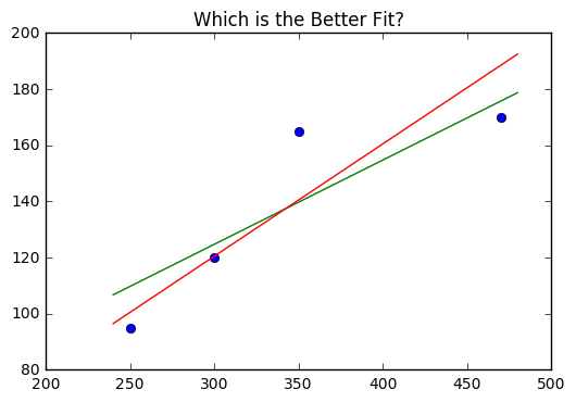
Suppose we were deciding between the lines
We want to compare the average difference between the actual and predicted values. We can find the residuals by creating a list of differences in terms of actual and predicted values.
In [7]:
def y1(x):
    return 0.3*x + 34.75

def y2(x):
    return 0.4*x + 0.5
In [8]:
plt.plot(cigs, death, 'o')
plt.plot(xs, y1(xs))
plt.plot(xs, y2(xs))
plt.title("Which is the Better Fit?")
Out[8]:
<matplotlib.text.Text at 0x110609e48>
In [9]:
resid_1 = [np.sqrt((death[i] - y1(cigs[i]))**2) for i in range(len(cigs))]
resid_2 = [np.sqrt((death[i] - y2(cigs[i]))**2) for i in range(len(cigs))]
In [10]:
resid_1
Out[10]:
[14.75, 4.75, 25.25, 5.75]
In [11]:
resid_2
Out[11]:
[5.5, 0.5, 24.5, 18.5]
In [12]:
resid_1_sq = [(a**2 )/4for a in resid_1]
resid_2_sq = [(a**2)/4 for a in resid_2]
In [13]:
np.sqrt(sum(resid_1_sq))
Out[13]:
15.089317413322579
In [14]:
np.sqrt(sum(resid_2_sq))
Out[14]:
15.596473960482221
Thus, the first line \(y1\) is considered a better fit for the data.
Deriving the Equation of the Line
In general, we have some line of best fit \(y\) given by:
If we have some set of points \((x_1, y_1), (x_2, y_2), (x_3, y_3)...(x_n, y_n)\). We need to minimize the sum of squares of residuals here, so we would have a number of values determined by:
which we can rewrite in summation notation as
We can consider this as a function in terms of the variable \(a\) that we are seeking to minimize.
From here, we can apply our familiar strategy of differentiating the function and locating the critical values. We are looking for the derivative of a sum, which turns out to be equivalent to the sum of the derivatives, hence we have
Setting this equal to zero and solving for \(a\) we get
The terms should be familiar as averages, and we can rewrite our equation as
We now use this to investigate a similar function in terms of \(b\) to complete our solution.
We end up with
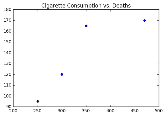
Let’s return to the problem of cigarette consumption and test our work out by manually computing \(a\) and \(b\).
In [15]:
cigs = [250, 300, 350, 470]
death = [95, 120, 165, 170]

plt.scatter(cigs, death)
plt.title("Cigarette Consumption vs. Deaths")
Out[15]:
<matplotlib.text.Text at 0x110677710>
In [16]:
ybar = np.mean(death)
xbar = np.mean(cigs)
ydiff = (death - ybar)
xdiff = (cigs - xbar)
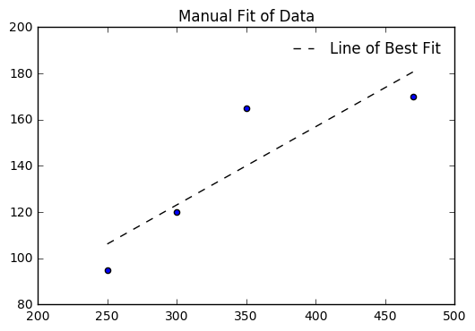
b = np.sum(ydiff*xdiff)/np.sum(xdiff**2)
a = ybar - b*xbar
a, b
Out[16]:
(21.621368322399249, 0.33833177132146203)
In [17]:
l = [a + b*i for i in cigs]
plt.scatter(cigs, death)
plt.plot(cigs, l, '--k', label = 'Line of Best Fit')
plt.title("Manual Fit of Data")
plt.legend(loc = 'best', frameon = False)
Out[17]:
<matplotlib.legend.Legend at 0x110898860>
We can check with numpy and see if our values for \(a\) and \(b\) agree with the computer model.
In [18]:
b2, a2 = np.polyfit(cigs, death, 1)
a2, b2
Out[18]:
(21.621368322399242, 0.33833177132146203)
Finally, we can write a simple function to compute the RMSE.
In [19]:
l
Out[19]:
[106.20431115276476, 123.12089971883786, 140.03748828491098, 180.6373008434864]
In [20]:
death
Out[20]:
[95, 120, 165, 170]
In [21]:
diff = [(l[i] - death[i])**2 for i in range(len(l))]
diff
Out[21]:
[125.53658840796878,
 9.7400150550422442,
 623.12699112595669,
 113.15216923483649]
In [22]:
np.sqrt(np.sum(diff)/len(l))
Out[22]:
14.761061647318972
Other Situations
Our goal with regression is to identify situations where regression makes sense, fit models and discuss the reasonableness of the model for describing the data. Data does not always come in linear forms however.
We can easily generate sample data for familiar curves. First, we can
make some lists of polynomial form, then we will add some noise to
these, fit models with np.polyfit(), and plot the results.
Non-Linear Functions
Plotting and fitting non-linear functions follows a similar pattern, however we need to take into consideration the nature of the function. First, if we see something following a polynomial pattern, we can just use whatever degree polynomial fit we believe is relevant. The derivation of these formulas follows the same structure as the linear case, except you are replacing the line \(a - bx_i\) with a polynomial \(a + bx_i + cx_i^2...\).
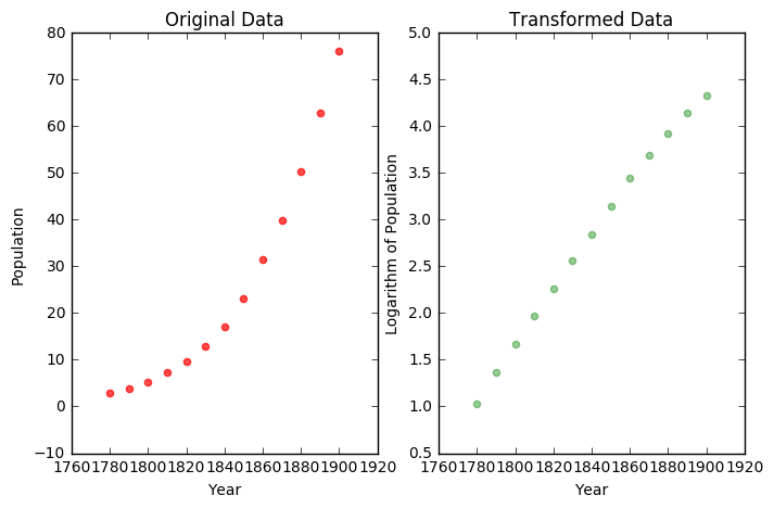
If we believe there to be an exponential fit, we can transform this into a linear situation using the logarithm. For example, suppose we have the following population data.
| Decade \(t\) | Year | Population |
|---|---|---|
| 0 | 1780 | 2.8 |
| 1 | 1790 | 3.9 |
| 2 | 1800 | 5.3 |
| 3 | 1810 | 7.2 |
If we examine the data, we see an exponential like trend. If we use NumPy to find the logarithm of the population values and plot the result, we note the transformed datas similarity to a linear function.
In [23]:
t = np.arange(0,13)
year = np.arange(1780,1910,10)
P = [2.8, 3.9, 5.3, 7.2, 9.6, 12.9, 17.1, 23.2, 31.4, 39.8, 50.2, 62.9, 76.0]
In [24]:
plt.figure(figsize = (8,5))
plt.subplot(1, 2, 1)
plt.scatter(year, P,color = 'red', alpha = 0.7)
plt.xlabel('Year')
plt.ylabel('Population')
plt.title("Original Data")

plt.subplot(1, 2, 2)
lnP = np.log(P)
plt.scatter(year, lnP, color = 'green', alpha = 0.4)
plt.xlabel('Year')
plt.ylabel('Logarithm of Population')
plt.title("Transformed Data")
Out[24]:
<matplotlib.text.Text at 0x110a026d8>
Symbolically, we would imagine the original function as an exponential of the form
The expression can be explored in a similar manner, where we use Sympy to find the effect of the logarithm.
In [25]:
y, a, b, x = sy.symbols('y a b x')
In [26]:
eq = sy.Eq(y, a*sy.exp(b*x))
In [27]:
sy.expand_log(sy.log(b**x))
Out[27]:
log(b**x)
In [28]:
sy.expand_log(sy.log(a*sy.exp(b*x)), force = True)
Out[28]:
b*x + log(a)
Hence, we have that
which should look like our familiar linear equations. Here, we can find \(a\) and \(b\), then convert the equation back to its original form by undoing the logarithm with the exponential.
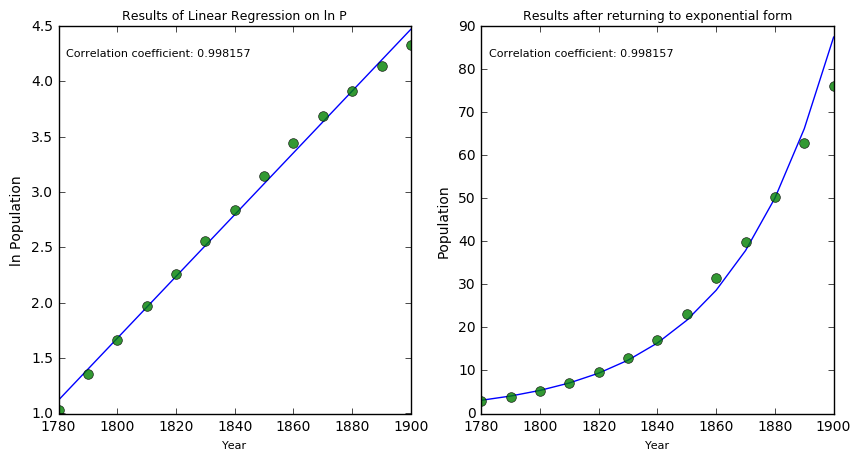
For kicks, we introduce the SciPy linregress function. Feel free to
examine the help documentation for the function. This gives a little
more information about the model than the polyfit function. Further,
we add text to the plot to display information about the model.
In [29]:
line = np.polyfit(year, lnP, 1)
fit = np.polyval(line, year)
alpha, beta, r_value, p_value, std_err = stats.linregress(year, lnP) #
alpha, beta, r_value
Out[29]:
(0.027906119028040688, -48.55083021891685, 0.99815691149842678)
In [30]:
fig = plt.figure(figsize = (10,5))

plt.subplot(1, 2, 2)
plt.plot(year, np.exp(fit))
plt.plot(year, P, 'o', markersize = 7, alpha = 0.8)
ax = fig.add_subplot(121)
text_string = "\nCorrelation coefficient: %f" % (r_value)
ax.text(0.022, 0.972, text_string, transform=ax.transAxes, verticalalignment='top',  fontsize=8)
plt.title("Results of Linear Regression on ln P", fontsize = 9)
plt.xlabel("Year", fontsize = 8)
plt.ylabel("ln Population")

plt.subplot(1, 2, 1)
plt.plot(year, fit)
plt.plot(year, lnP, 'o', markersize = 7, alpha = 0.8)
ax = fig.add_subplot(122)
text_string = "\nCorrelation coefficient: %f" % (r_value)
ax.text(0.022, 0.972, text_string, transform=ax.transAxes, verticalalignment='top',  fontsize=8)
plt.title("Results after returning to exponential form", fontsize = 9)
plt.xlabel("Year", fontsize = 8)
plt.ylabel("Population")
Out[30]:
<matplotlib.text.Text at 0x110c1c748>
Logistic Example
As you see above, towards the end of our model the actual and predicted values seem to diverge. Considering the context, this makes sense. A population should reach some maximum levels due to physical resources. A more S shaped curve is the logistic function which is given by
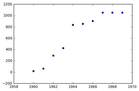
As an example, consider the Inter Continental Ballistic Missle Data for 1960 - 1969.
| Year | Number of ICBM’s |
|---|---|
| 1960 | 18 |
| 1961 | 63 |
| 1962 | 294 |
| 1963 | 424 |
| 1964 | 834 |
| 1965 | 854 |
| 1966 | 904 |
| 1967 | 1054 |
| 1968 | 1054 |
| 1969 | 1054 |
In [31]:
year = [i for i in np.arange(1960, 1970, 1)]
icbm = [18, 63, 294, 424, 834, 854, 904, 1054, 1054, 1054]
In [32]:
plt.scatter(year, icbm)
Out[32]:
<matplotlib.collections.PathCollection at 0x1107ab748>
In [33]:
L, y, a, b, x = sy.symbols('L y a b x')
In [34]:
exp = sy.Eq(y, L/(1 + sy.exp(a + b*x)))
In [35]:
sy.solve(exp, (a + b*x), force = True)
Out[35]:
[log((L - y)/y)]
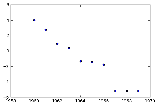
This means that the tranformation that linearizes our data is
The value \(L\) is defined as the carrying capacity of the model. Here, it seems something like \(L = 1060\) would be a reasonable value to try.
In [36]:
t_icbm = [np.log((1060 - i)/i) for i in icbm]
In [37]:
plt.scatter(year, t_icbm)
Out[37]:
<matplotlib.collections.PathCollection at 0x111183cf8>
In [38]:
b, a = np.polyfit(year, t_icbm, 1)
In [39]:
a, b
Out[39]:
(2091.7866057847828, -1.0653944179379069)
In [40]:
def l(x):
    return b*x + a

l(1960), l(1969)
Out[40]:
(3.6135466264850038, -5.9750031349558412)
In [41]:
fit = [l(i) for i in year]
In [42]:
plt.scatter(year, t_icbm)
plt.plot(year, fit)
plt.title("Fitting ICBM Data")
plt.xlabel("Year")
plt.ylabel("Transformed ICMB Data")
Out[42]:
<matplotlib.text.Text at 0x1111ed320>
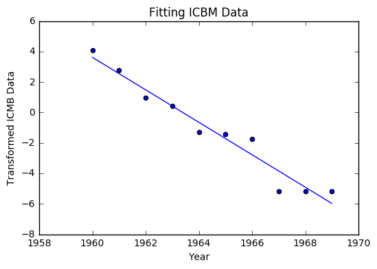
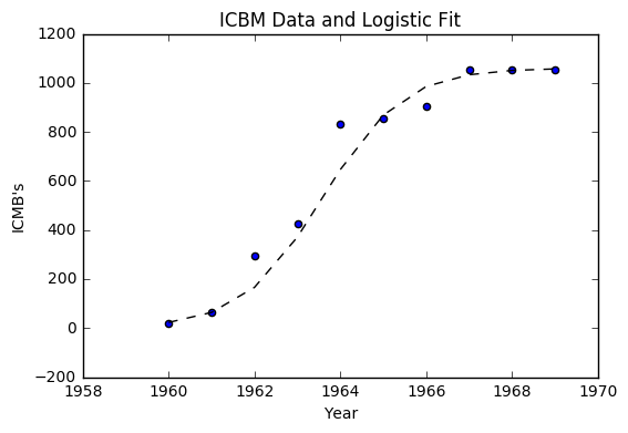
Much like the last example, we can return everything to its original form with the exponential. We arrive at the equation
In [43]:
def y(x):
    return 1060/(1 + np.exp(2092 - 1.0654*x))

o_fit = [y(i) for i in year]
In [44]:
plt.scatter(year, icbm)
plt.plot(year, o_fit, '--k')
plt.title("ICBM Data and Logistic Fit")
plt.xlabel("Year")
plt.ylabel("ICMB's")
Out[44]:
<matplotlib.text.Text at 0x1111c0d30>
Machine Learning Example
In [46]:
import matplotlib.pyplot as plt
import numpy as np
from sklearn import datasets, linear_model
from sklearn.metrics import mean_squared_error, r2_score

# Load the diabetes dataset
diabetes = datasets.load_diabetes()
# Use only one feature
diabetes_X = diabetes.data[:, np.newaxis, 2]
In [61]:
diabetes_X[:5]
Out[61]:
array([[ 0.06169621],
       [-0.05147406],
       [ 0.04445121],
       [-0.01159501],
       [-0.03638469]])
In [64]:
datasets?
In [53]:
# Split the data into training/testing sets
diabetes_X_train = diabetes_X[:-20]
diabetes_X_test = diabetes_X[-20:]

# Split the targets into training/testing sets
diabetes_y_train = diabetes.target[:-20]
diabetes_y_test = diabetes.target[-20:]
In [60]:
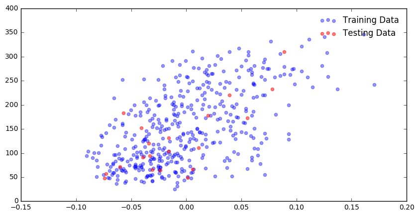
plt.figure(figsize = (10,5))
plt.scatter(diabetes_X_train, diabetes_y_train, color = 'blue', alpha = 0.4, label = "Training Data")
plt.scatter(diabetes_X_test, diabetes_y_test, color = 'red', alpha = 0.5, label = "Testing Data")
plt.legend(frameon = False)
Out[60]:
<matplotlib.legend.Legend at 0x1123e16a0>
In [65]:
# Create linear regression object
regr = linear_model.LinearRegression()

# Train the model using the training sets
regr.fit(diabetes_X_train, diabetes_y_train)

# Make predictions using the testing set
diabetes_y_pred = regr.predict(diabetes_X_test)
In [66]:
# The coefficients
print('Coefficients: \n', regr.coef_)
# The mean squared error
print("Mean squared error: %.2f"
      % mean_squared_error(diabetes_y_test, diabetes_y_pred))
# Explained variance score: 1 is perfect prediction
print('Variance score: %.2f' % r2_score(diabetes_y_test, diabetes_y_pred))
Coefficients:
 [ 938.23786125]
Mean squared error: 2548.07
Variance score: 0.47
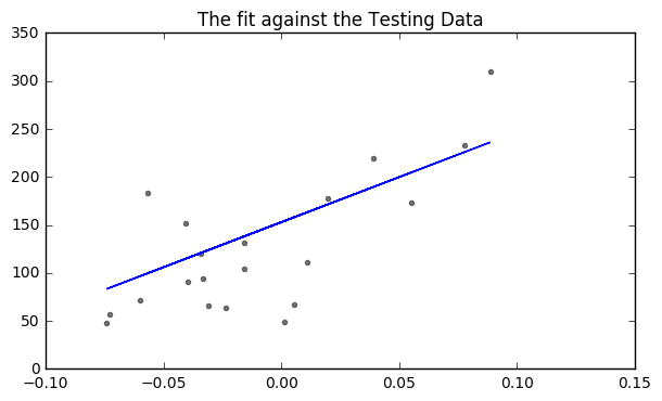
In [75]:
# Plot outputs
plt.figure(figsize = (7,4))
plt.scatter(diabetes_X_test, diabetes_y_test,  color='black', alpha = 0.5, s = 9)
plt.plot(diabetes_X_test, diabetes_y_pred, color='blue')
plt.title("The fit against the Testing Data")
Out[75]:
<matplotlib.text.Text at 0x112c6b748>
Problems
In [123]:
from sklearn.datasets import load_iris
iris = load_iris()
data = iris.data
column_names = iris.feature_names
In [134]:
print(iris.DESCR)
Iris Plants Database

Notes
-----
Data Set Characteristics:
    :Number of Instances: 150 (50 in each of three classes)
    :Number of Attributes: 4 numeric, predictive attributes and the class
    :Attribute Information:
        - sepal length in cm
        - sepal width in cm
        - petal length in cm
        - petal width in cm
        - class:
                - Iris-Setosa
                - Iris-Versicolour
                - Iris-Virginica
    :Summary Statistics:

    ============== ==== ==== ======= ===== ====================
                    Min  Max   Mean    SD   Class Correlation
    ============== ==== ==== ======= ===== ====================
    sepal length:   4.3  7.9   5.84   0.83    0.7826
    sepal width:    2.0  4.4   3.05   0.43   -0.4194
    petal length:   1.0  6.9   3.76   1.76    0.9490  (high!)
    petal width:    0.1  2.5   1.20  0.76     0.9565  (high!)
    ============== ==== ==== ======= ===== ====================

    :Missing Attribute Values: None
    :Class Distribution: 33.3% for each of 3 classes.
    :Creator: R.A. Fisher
    :Donor: Michael Marshall (MARSHALL%PLU@io.arc.nasa.gov)
    :Date: July, 1988

This is a copy of UCI ML iris datasets.
http://archive.ics.uci.edu/ml/datasets/Iris

The famous Iris database, first used by Sir R.A Fisher

This is perhaps the best known database to be found in the
pattern recognition literature.  Fisher's paper is a classic in the field and
is referenced frequently to this day.  (See Duda & Hart, for example.)  The
data set contains 3 classes of 50 instances each, where each class refers to a
type of iris plant.  One class is linearly separable from the other 2; the
latter are NOT linearly separable from each other.

References
----------
   - Fisher,R.A. "The use of multiple measurements in taxonomic problems"
     Annual Eugenics, 7, Part II, 179-188 (1936); also in "Contributions to
     Mathematical Statistics" (John Wiley, NY, 1950).
   - Duda,R.O., & Hart,P.E. (1973) Pattern Classification and Scene Analysis.
     (Q327.D83) John Wiley & Sons.  ISBN 0-471-22361-1.  See page 218.
   - Dasarathy, B.V. (1980) "Nosing Around the Neighborhood: A New System
     Structure and Classification Rule for Recognition in Partially Exposed
     Environments".  IEEE Transactions on Pattern Analysis and Machine
     Intelligence, Vol. PAMI-2, No. 1, 67-71.
   - Gates, G.W. (1972) "The Reduced Nearest Neighbor Rule".  IEEE Transactions
     on Information Theory, May 1972, 431-433.
   - See also: 1988 MLC Proceedings, 54-64.  Cheeseman et al"s AUTOCLASS II
     conceptual clustering system finds 3 classes in the data.
   - Many, many more ...
In [125]:
data
Out[125]:
array([[ 5.1,  3.5,  1.4,  0.2],
       [ 4.9,  3. ,  1.4,  0.2],
       [ 4.7,  3.2,  1.3,  0.2],
       [ 4.6,  3.1,  1.5,  0.2],
       [ 5. ,  3.6,  1.4,  0.2],
       [ 5.4,  3.9,  1.7,  0.4],
       [ 4.6,  3.4,  1.4,  0.3],
       [ 5. ,  3.4,  1.5,  0.2],
       [ 4.4,  2.9,  1.4,  0.2],
       [ 4.9,  3.1,  1.5,  0.1],
       [ 5.4,  3.7,  1.5,  0.2],
       [ 4.8,  3.4,  1.6,  0.2],
       [ 4.8,  3. ,  1.4,  0.1],
       [ 4.3,  3. ,  1.1,  0.1],
       [ 5.8,  4. ,  1.2,  0.2],
       [ 5.7,  4.4,  1.5,  0.4],
       [ 5.4,  3.9,  1.3,  0.4],
       [ 5.1,  3.5,  1.4,  0.3],
       [ 5.7,  3.8,  1.7,  0.3],
       [ 5.1,  3.8,  1.5,  0.3],
       [ 5.4,  3.4,  1.7,  0.2],
       [ 5.1,  3.7,  1.5,  0.4],
       [ 4.6,  3.6,  1. ,  0.2],
       [ 5.1,  3.3,  1.7,  0.5],
       [ 4.8,  3.4,  1.9,  0.2],
       [ 5. ,  3. ,  1.6,  0.2],
       [ 5. ,  3.4,  1.6,  0.4],
       [ 5.2,  3.5,  1.5,  0.2],
       [ 5.2,  3.4,  1.4,  0.2],
       [ 4.7,  3.2,  1.6,  0.2],
       [ 4.8,  3.1,  1.6,  0.2],
       [ 5.4,  3.4,  1.5,  0.4],
       [ 5.2,  4.1,  1.5,  0.1],
       [ 5.5,  4.2,  1.4,  0.2],
       [ 4.9,  3.1,  1.5,  0.1],
       [ 5. ,  3.2,  1.2,  0.2],
       [ 5.5,  3.5,  1.3,  0.2],
       [ 4.9,  3.1,  1.5,  0.1],
       [ 4.4,  3. ,  1.3,  0.2],
       [ 5.1,  3.4,  1.5,  0.2],
       [ 5. ,  3.5,  1.3,  0.3],
       [ 4.5,  2.3,  1.3,  0.3],
       [ 4.4,  3.2,  1.3,  0.2],
       [ 5. ,  3.5,  1.6,  0.6],
       [ 5.1,  3.8,  1.9,  0.4],
       [ 4.8,  3. ,  1.4,  0.3],
       [ 5.1,  3.8,  1.6,  0.2],
       [ 4.6,  3.2,  1.4,  0.2],
       [ 5.3,  3.7,  1.5,  0.2],
       [ 5. ,  3.3,  1.4,  0.2],
       [ 7. ,  3.2,  4.7,  1.4],
       [ 6.4,  3.2,  4.5,  1.5],
       [ 6.9,  3.1,  4.9,  1.5],
       [ 5.5,  2.3,  4. ,  1.3],
       [ 6.5,  2.8,  4.6,  1.5],
       [ 5.7,  2.8,  4.5,  1.3],
       [ 6.3,  3.3,  4.7,  1.6],
       [ 4.9,  2.4,  3.3,  1. ],
       [ 6.6,  2.9,  4.6,  1.3],
       [ 5.2,  2.7,  3.9,  1.4],
       [ 5. ,  2. ,  3.5,  1. ],
       [ 5.9,  3. ,  4.2,  1.5],
       [ 6. ,  2.2,  4. ,  1. ],
       [ 6.1,  2.9,  4.7,  1.4],
       [ 5.6,  2.9,  3.6,  1.3],
       [ 6.7,  3.1,  4.4,  1.4],
       [ 5.6,  3. ,  4.5,  1.5],
       [ 5.8,  2.7,  4.1,  1. ],
       [ 6.2,  2.2,  4.5,  1.5],
       [ 5.6,  2.5,  3.9,  1.1],
       [ 5.9,  3.2,  4.8,  1.8],
       [ 6.1,  2.8,  4. ,  1.3],
       [ 6.3,  2.5,  4.9,  1.5],
       [ 6.1,  2.8,  4.7,  1.2],
       [ 6.4,  2.9,  4.3,  1.3],
       [ 6.6,  3. ,  4.4,  1.4],
       [ 6.8,  2.8,  4.8,  1.4],
       [ 6.7,  3. ,  5. ,  1.7],
       [ 6. ,  2.9,  4.5,  1.5],
       [ 5.7,  2.6,  3.5,  1. ],
       [ 5.5,  2.4,  3.8,  1.1],
       [ 5.5,  2.4,  3.7,  1. ],
       [ 5.8,  2.7,  3.9,  1.2],
       [ 6. ,  2.7,  5.1,  1.6],
       [ 5.4,  3. ,  4.5,  1.5],
       [ 6. ,  3.4,  4.5,  1.6],
       [ 6.7,  3.1,  4.7,  1.5],
       [ 6.3,  2.3,  4.4,  1.3],
       [ 5.6,  3. ,  4.1,  1.3],
       [ 5.5,  2.5,  4. ,  1.3],
       [ 5.5,  2.6,  4.4,  1.2],
       [ 6.1,  3. ,  4.6,  1.4],
       [ 5.8,  2.6,  4. ,  1.2],
       [ 5. ,  2.3,  3.3,  1. ],
       [ 5.6,  2.7,  4.2,  1.3],
       [ 5.7,  3. ,  4.2,  1.2],
       [ 5.7,  2.9,  4.2,  1.3],
       [ 6.2,  2.9,  4.3,  1.3],
       [ 5.1,  2.5,  3. ,  1.1],
       [ 5.7,  2.8,  4.1,  1.3],
       [ 6.3,  3.3,  6. ,  2.5],
       [ 5.8,  2.7,  5.1,  1.9],
       [ 7.1,  3. ,  5.9,  2.1],
       [ 6.3,  2.9,  5.6,  1.8],
       [ 6.5,  3. ,  5.8,  2.2],
       [ 7.6,  3. ,  6.6,  2.1],
       [ 4.9,  2.5,  4.5,  1.7],
       [ 7.3,  2.9,  6.3,  1.8],
       [ 6.7,  2.5,  5.8,  1.8],
       [ 7.2,  3.6,  6.1,  2.5],
       [ 6.5,  3.2,  5.1,  2. ],
       [ 6.4,  2.7,  5.3,  1.9],
       [ 6.8,  3. ,  5.5,  2.1],
       [ 5.7,  2.5,  5. ,  2. ],
       [ 5.8,  2.8,  5.1,  2.4],
       [ 6.4,  3.2,  5.3,  2.3],
       [ 6.5,  3. ,  5.5,  1.8],
       [ 7.7,  3.8,  6.7,  2.2],
       [ 7.7,  2.6,  6.9,  2.3],
       [ 6. ,  2.2,  5. ,  1.5],
       [ 6.9,  3.2,  5.7,  2.3],
       [ 5.6,  2.8,  4.9,  2. ],
       [ 7.7,  2.8,  6.7,  2. ],
       [ 6.3,  2.7,  4.9,  1.8],
       [ 6.7,  3.3,  5.7,  2.1],
       [ 7.2,  3.2,  6. ,  1.8],
       [ 6.2,  2.8,  4.8,  1.8],
       [ 6.1,  3. ,  4.9,  1.8],
       [ 6.4,  2.8,  5.6,  2.1],
       [ 7.2,  3. ,  5.8,  1.6],
       [ 7.4,  2.8,  6.1,  1.9],
       [ 7.9,  3.8,  6.4,  2. ],
       [ 6.4,  2.8,  5.6,  2.2],
       [ 6.3,  2.8,  5.1,  1.5],
       [ 6.1,  2.6,  5.6,  1.4],
       [ 7.7,  3. ,  6.1,  2.3],
       [ 6.3,  3.4,  5.6,  2.4],
       [ 6.4,  3.1,  5.5,  1.8],
       [ 6. ,  3. ,  4.8,  1.8],
       [ 6.9,  3.1,  5.4,  2.1],
       [ 6.7,  3.1,  5.6,  2.4],
       [ 6.9,  3.1,  5.1,  2.3],
       [ 5.8,  2.7,  5.1,  1.9],
       [ 6.8,  3.2,  5.9,  2.3],
       [ 6.7,  3.3,  5.7,  2.5],
       [ 6.7,  3. ,  5.2,  2.3],
       [ 6.3,  2.5,  5. ,  1.9],
       [ 6.5,  3. ,  5.2,  2. ],
       [ 6.2,  3.4,  5.4,  2.3],
       [ 5.9,  3. ,  5.1,  1.8]])
In [126]:
df = pd.DataFrame(data)
In [127]:
df.columns = column_names
In [128]:
df.head()
Out[128]:
| sepal length (cm) | sepal width (cm) | petal length (cm) | petal width (cm) | |
|---|---|---|---|---|
| 0 | 5.1 | 3.5 | 1.4 | 0.2 |
| 1 | 4.9 | 3.0 | 1.4 | 0.2 |
| 2 | 4.7 | 3.2 | 1.3 | 0.2 |
| 3 | 4.6 | 3.1 | 1.5 | 0.2 |
| 4 | 5.0 | 3.6 | 1.4 | 0.2 |
In [129]:
df.iloc[:, [1]].head()
Out[129]:
| sepal width (cm) | |
|---|---|
| 0 | 3.5 |
| 1 | 3.0 |
| 2 | 3.2 |
| 3 | 3.1 |
| 4 | 3.6 |
In [130]:
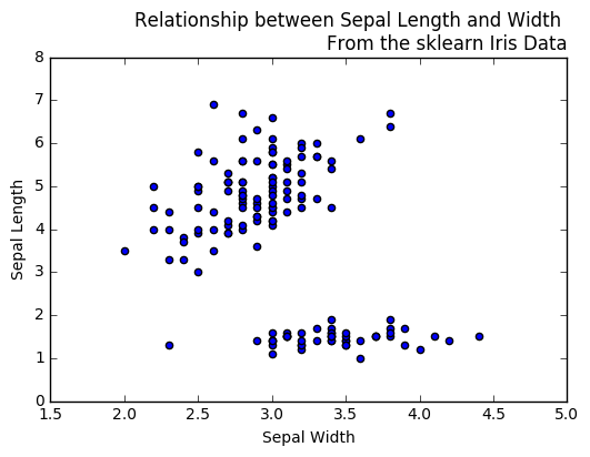
plt.figure()
plt.scatter(df.iloc[:,1], df.iloc[:,2])
plt.xlabel("Sepal Width")
plt.ylabel("Sepal Length")
plt.title("Relationship between Sepal Length and Width \nFrom the sklearn Iris Data", loc = 'right', fontsize = 12)
Out[130]:
<matplotlib.text.Text at 0x11b63c080>
In [131]:
df.describe()
Out[131]:
| sepal length (cm) | sepal width (cm) | petal length (cm) | petal width (cm) | |
|---|---|---|---|---|
| count | 150.000000 | 150.000000 | 150.000000 | 150.000000 |
| mean | 5.843333 | 3.054000 | 3.758667 | 1.198667 |
| std | 0.828066 | 0.433594 | 1.764420 | 0.763161 |
| min | 4.300000 | 2.000000 | 1.000000 | 0.100000 |
| 25% | 5.100000 | 2.800000 | 1.600000 | 0.300000 |
| 50% | 5.800000 | 3.000000 | 4.350000 | 1.300000 |
| 75% | 6.400000 | 3.300000 | 5.100000 | 1.800000 |
| max | 7.900000 | 4.400000 | 6.900000 | 2.500000 |
In [132]:
from sklearn.datasets import load_boston
boston = load_boston()
bdata = boston.data
bcolumn_names = boston.feature_names
In [133]:
print(boston.DESCR)
Boston House Prices dataset

Notes
------
Data Set Characteristics:

    :Number of Instances: 506

    :Number of Attributes: 13 numeric/categorical predictive

    :Median Value (attribute 14) is usually the target

    :Attribute Information (in order):
        - CRIM     per capita crime rate by town
        - ZN       proportion of residential land zoned for lots over 25,000 sq.ft.
        - INDUS    proportion of non-retail business acres per town
        - CHAS     Charles River dummy variable (= 1 if tract bounds river; 0 otherwise)
        - NOX      nitric oxides concentration (parts per 10 million)
        - RM       average number of rooms per dwelling
        - AGE      proportion of owner-occupied units built prior to 1940
        - DIS      weighted distances to five Boston employment centres
        - RAD      index of accessibility to radial highways
        - TAX      full-value property-tax rate per $10,000
        - PTRATIO  pupil-teacher ratio by town
        - B        1000(Bk - 0.63)^2 where Bk is the proportion of blacks by town
        - LSTAT    % lower status of the population
        - MEDV     Median value of owner-occupied homes in $1000's

    :Missing Attribute Values: None

    :Creator: Harrison, D. and Rubinfeld, D.L.

This is a copy of UCI ML housing dataset.
http://archive.ics.uci.edu/ml/datasets/Housing


This dataset was taken from the StatLib library which is maintained at Carnegie Mellon University.

The Boston house-price data of Harrison, D. and Rubinfeld, D.L. 'Hedonic
prices and the demand for clean air', J. Environ. Economics & Management,
vol.5, 81-102, 1978.   Used in Belsley, Kuh & Welsch, 'Regression diagnostics
...', Wiley, 1980.   N.B. Various transformations are used in the table on
pages 244-261 of the latter.

The Boston house-price data has been used in many machine learning papers that address regression
problems.

**References**

   - Belsley, Kuh & Welsch, 'Regression diagnostics: Identifying Influential Data and Sources of Collinearity', Wiley, 1980. 244-261.
   - Quinlan,R. (1993). Combining Instance-Based and Model-Based Learning. In Proceedings on the Tenth International Conference of Machine Learning, 236-243, University of Massachusetts, Amherst. Morgan Kaufmann.
   - many more! (see http://archive.ics.uci.edu/ml/datasets/Housing)
In [117]:
df2 = pd.DataFrame(bdata)
In [118]:
df2.columns = bcolumn_names
In [119]:
df2.head()
Out[119]:
| CRIM | ZN | INDUS | CHAS | NOX | RM | AGE | DIS | RAD | TAX | PTRATIO | B | LSTAT | |
|---|---|---|---|---|---|---|---|---|---|---|---|---|---|
| 0 | 0.00632 | 18.0 | 2.31 | 0.0 | 0.538 | 6.575 | 65.2 | 4.0900 | 1.0 | 296.0 | 15.3 | 396.90 | 4.98 |
| 1 | 0.02731 | 0.0 | 7.07 | 0.0 | 0.469 | 6.421 | 78.9 | 4.9671 | 2.0 | 242.0 | 17.8 | 396.90 | 9.14 |
| 2 | 0.02729 | 0.0 | 7.07 | 0.0 | 0.469 | 7.185 | 61.1 | 4.9671 | 2.0 | 242.0 | 17.8 | 392.83 | 4.03 |
| 3 | 0.03237 | 0.0 | 2.18 | 0.0 | 0.458 | 6.998 | 45.8 | 6.0622 | 3.0 | 222.0 | 18.7 | 394.63 | 2.94 |
| 4 | 0.06905 | 0.0 | 2.18 | 0.0 | 0.458 | 7.147 | 54.2 | 6.0622 | 3.0 | 222.0 | 18.7 | 396.90 | 5.33 |